Home
Services
Website Design & Development
SEO
SEO Audit
Maintenance
Resources
Articles
YouTube Videos
Lead Value Calculator
Company
About Us
Contact Us
Testimonials
Case Studies
Schedule a Call
Home
>
Articles
Our SEO Articles
Grow Your Website Using Our In-Depth SEO Resources
Schedule a Call
Featured In
Articles On AEO
Complete AEO Guide
AEO
Articles On SEO
Complete SEO Guide
SEO
Articles On Technical SEO
Technical SEO Guide
SEO
Technical
Understand How To Optimize URLs
SEO
Technical
Understanding Canonical Tags
SEO
Technical
Making Pagination SEO Friendly
SEO
Technical
Learn About Schema Markup
SEO
Technical
Learning About Orphan Pages
SEO
Technical
Understanding Web Page Indexing
SEO
Technical
Everything You Need To Know About Crawl Budget
SEO
Technical
Articles On Semantic HTML
Understanding HTML Semantic Elements
SEO
Technical
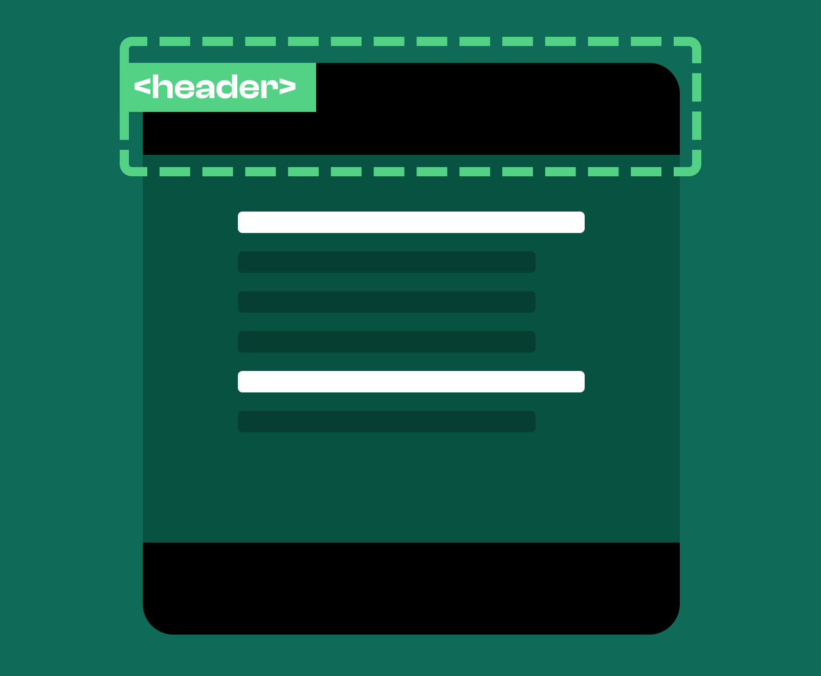
Semantic HTML: Header Tags
SEO
Technical
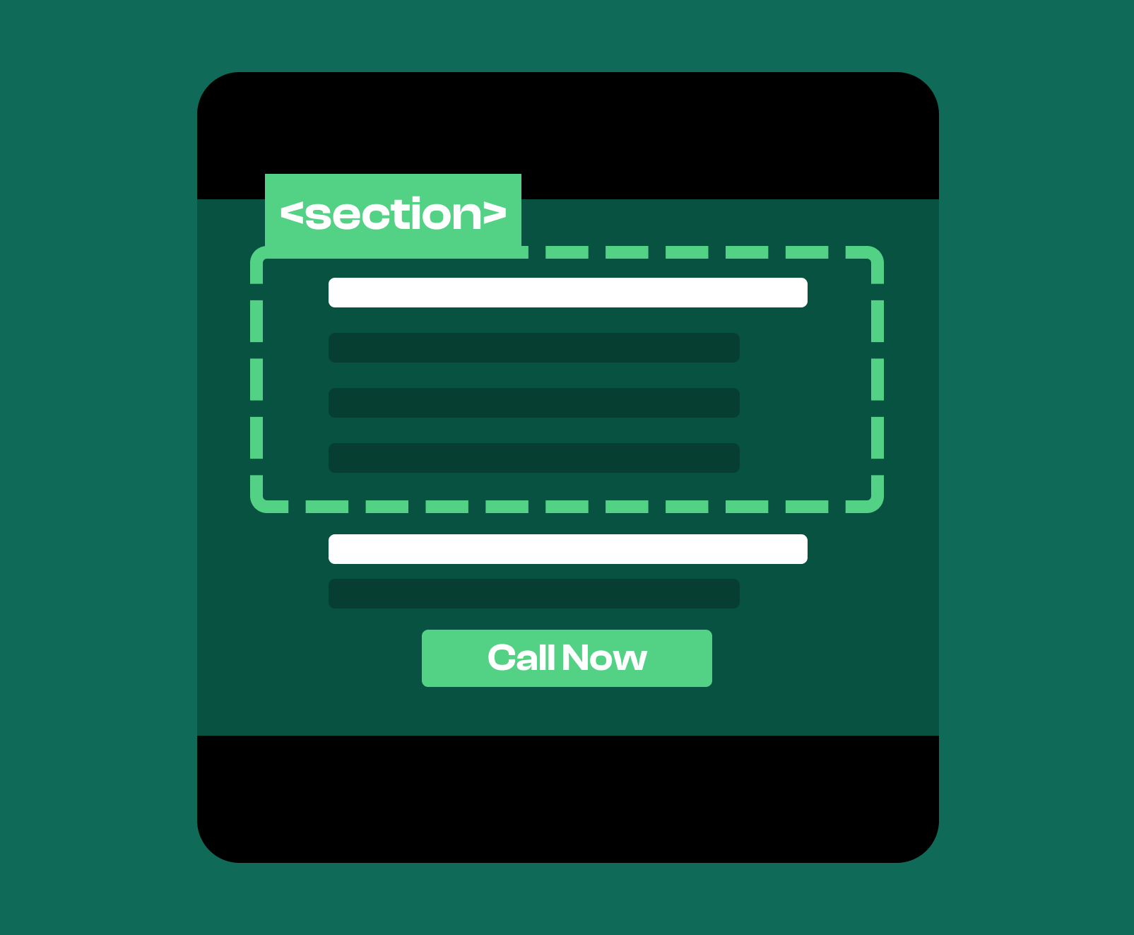
Semantic HTML: Section Tags
SEO
Technical
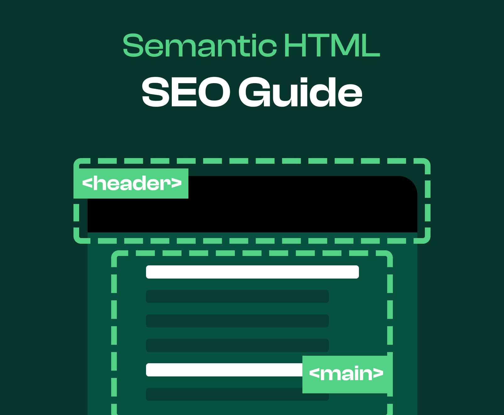
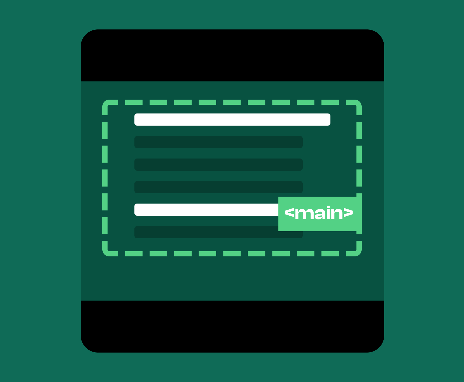
Semantic HTML: Main Tags
SEO
Technical
Semantic HTML: Footer Tags
SEO
Technical
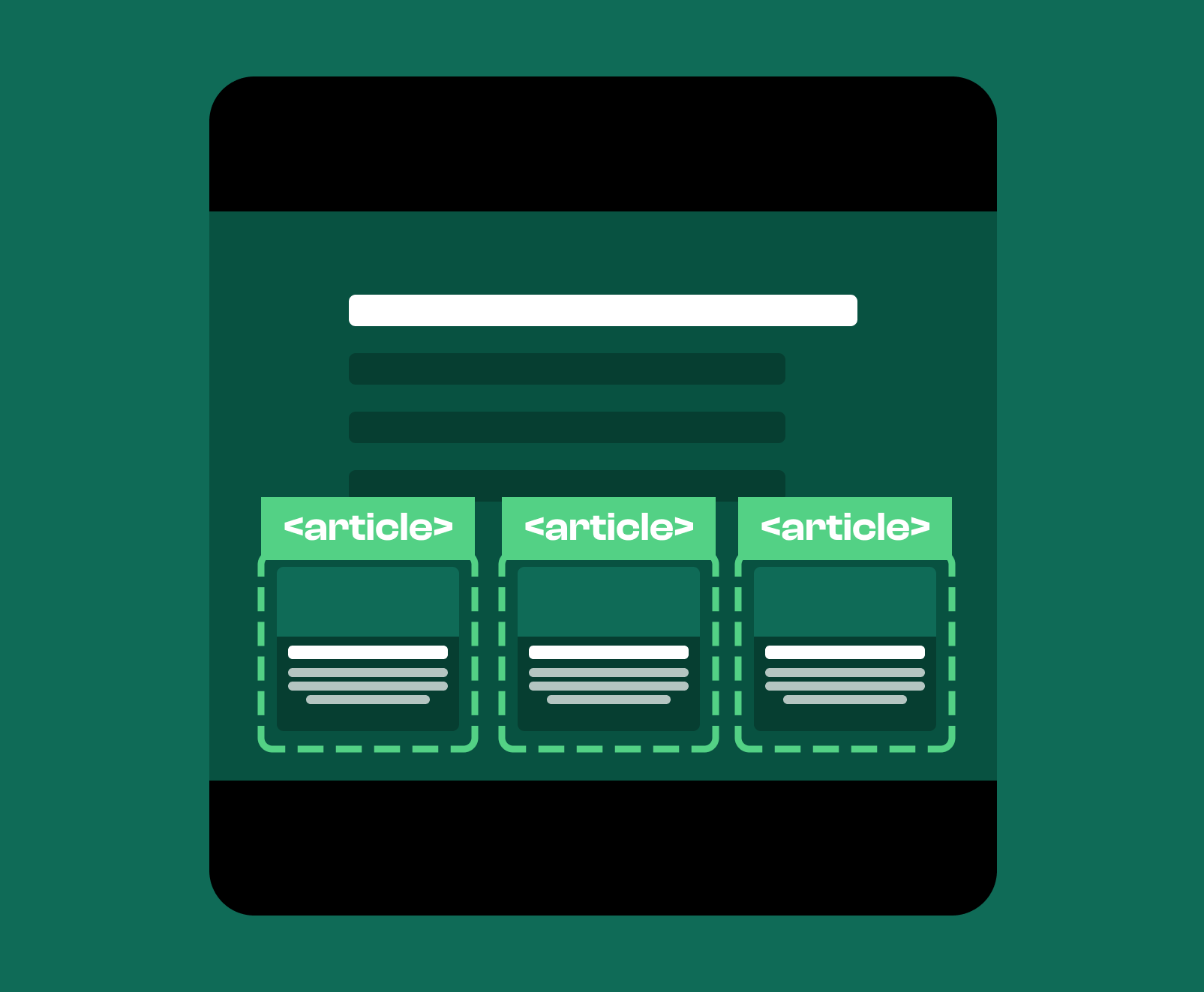
Semantic HTML: Article Tags
SEO
Technical
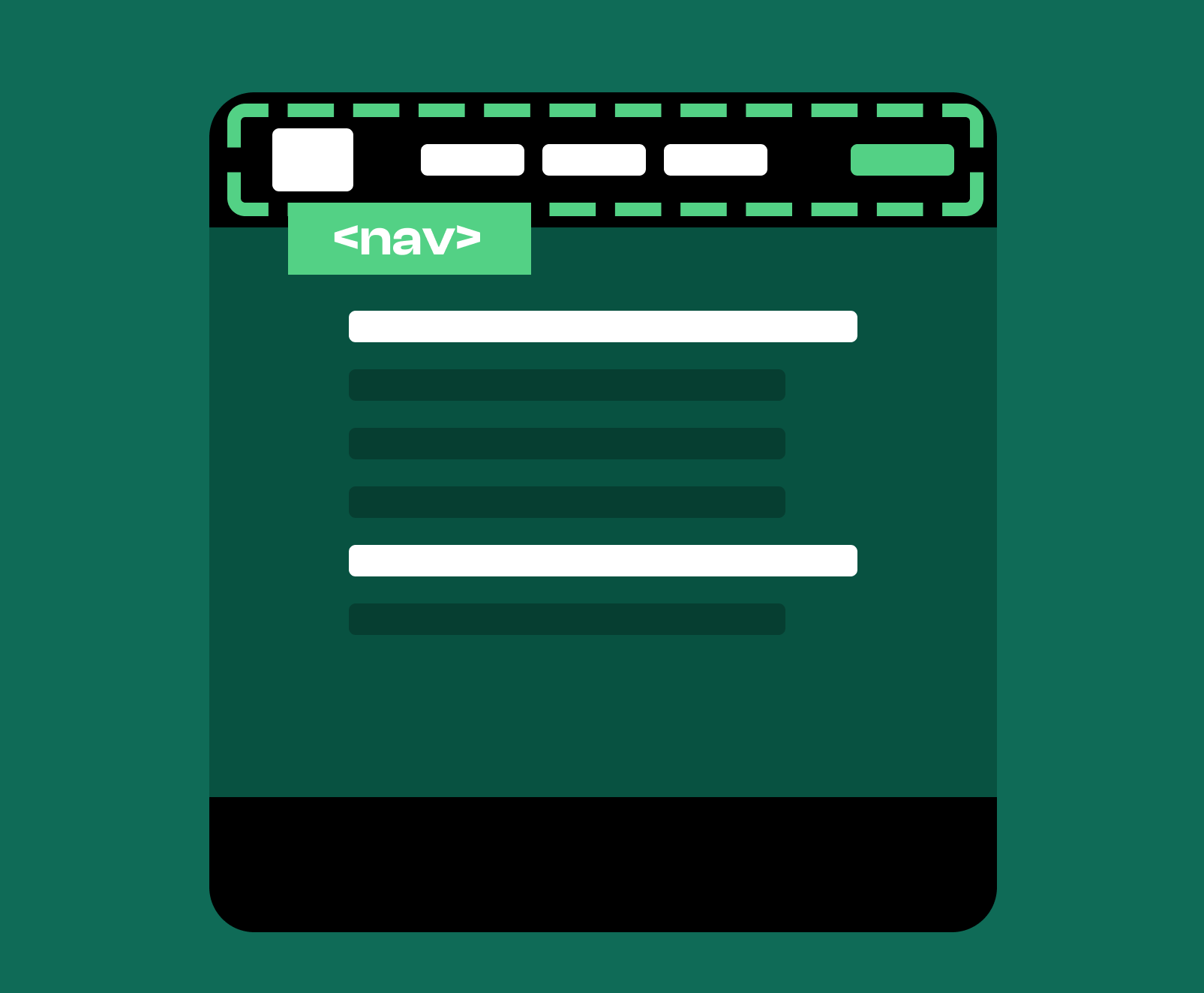
Semantic HTML: Nav Tags
SEO
Technical
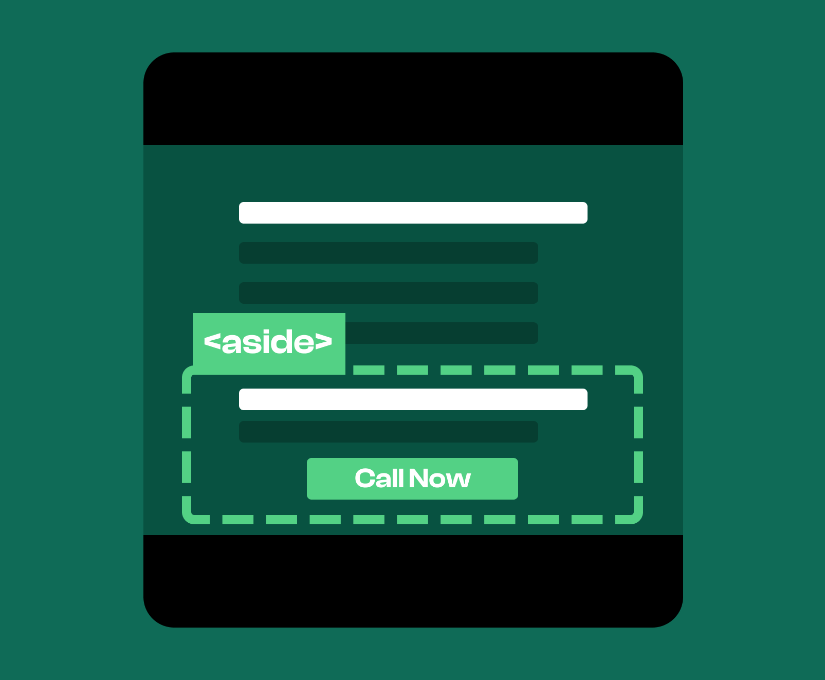
Semantic HTML: Aside Tags
SEO
Technical
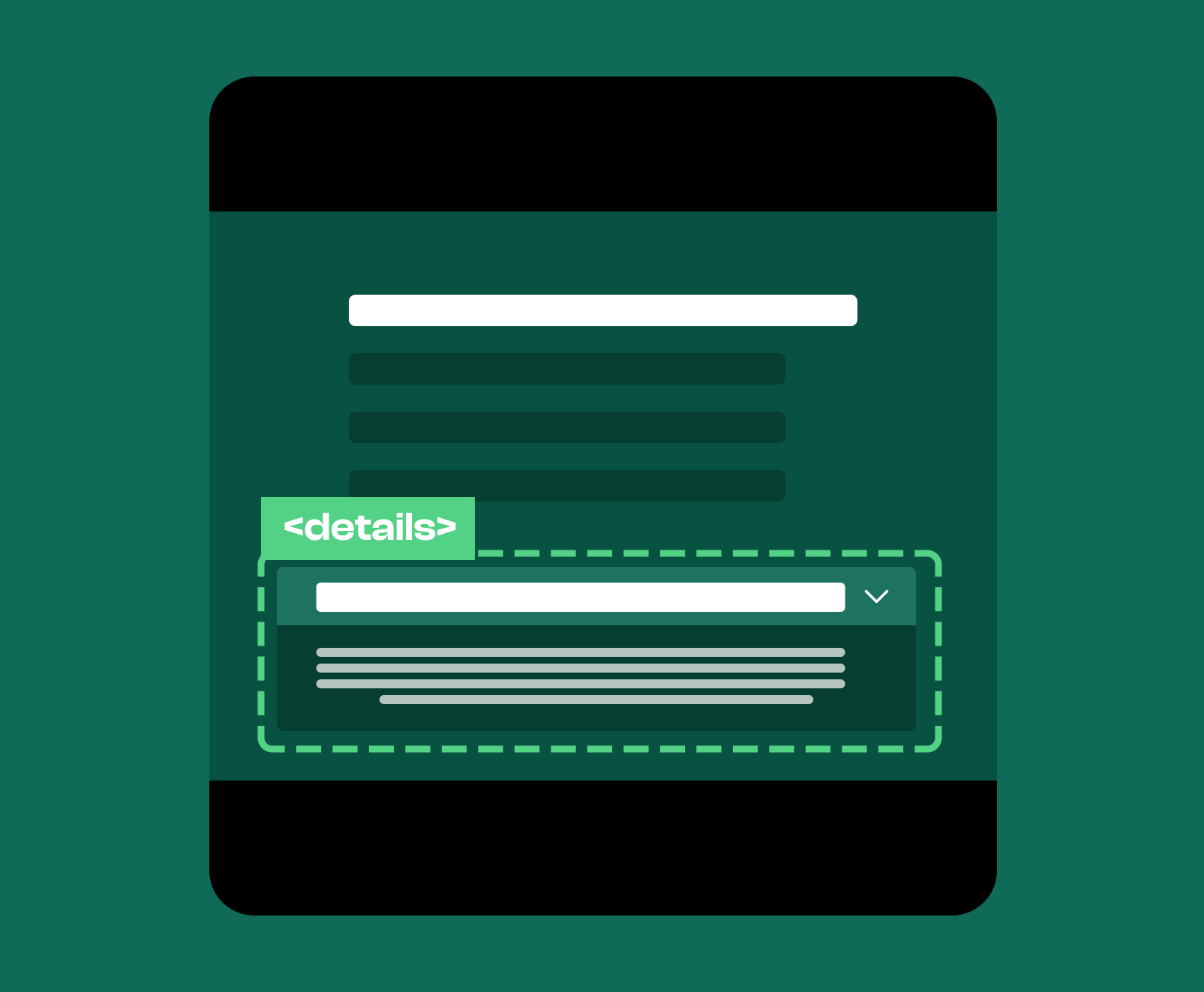
Semantic HTML: Details Tags
SEO
Technical
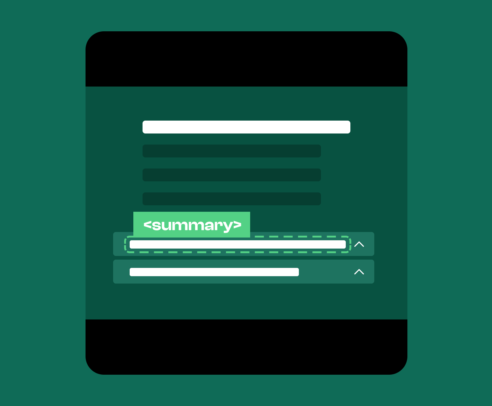
Semantic HTML: Summary Tags
SEO
Technical
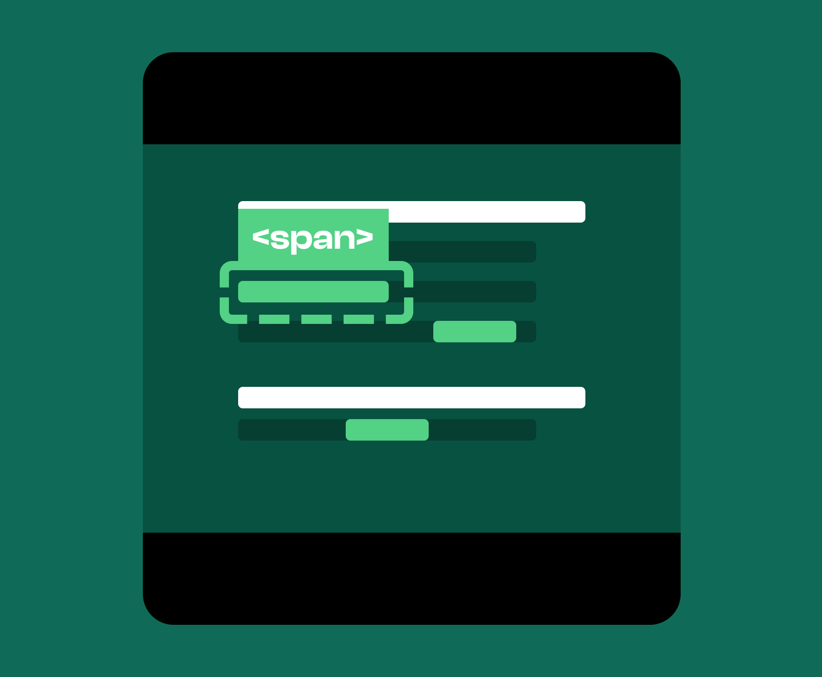
Semantic HTML: Span Tags
SEO
Technical
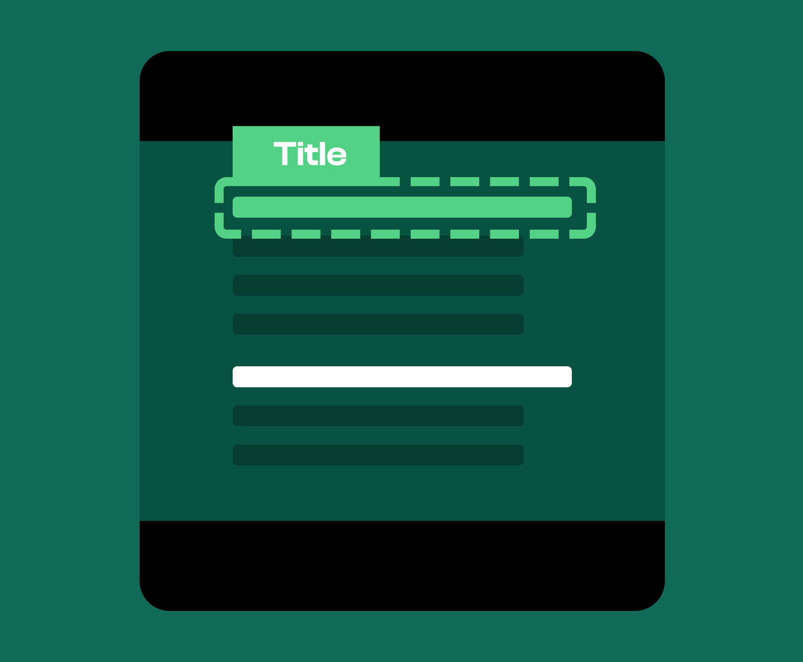
Semantic HTML: Title
SEO
Technical
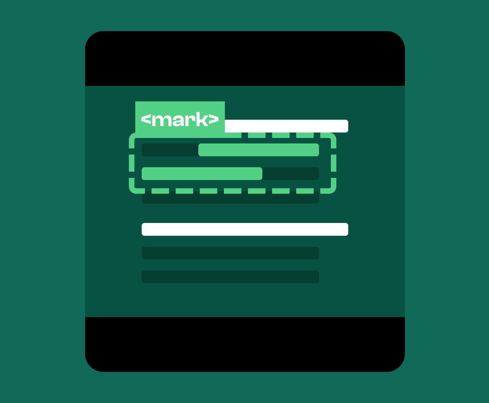
Semantic HTML: Mark
SEO
Technical
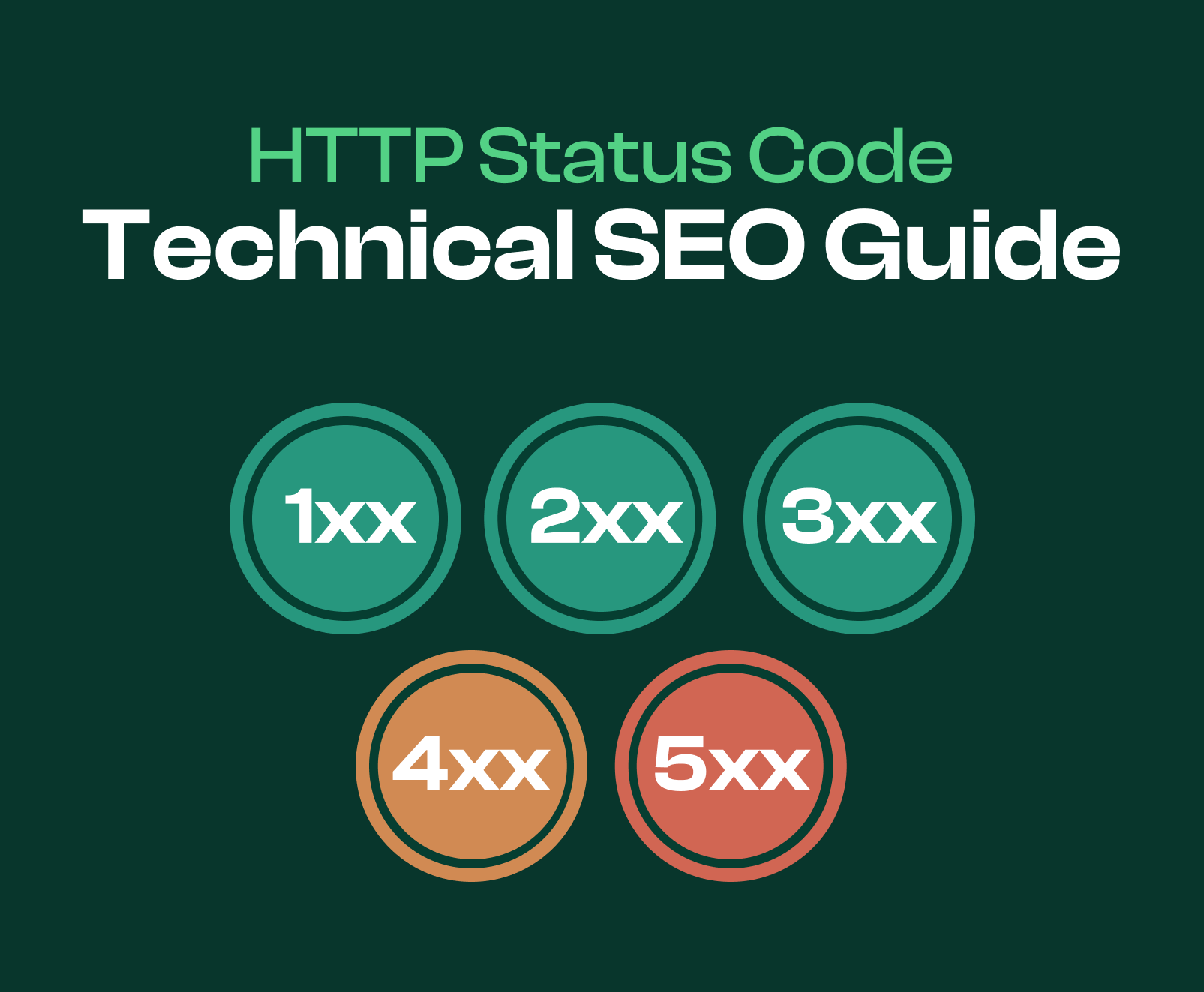
Articles On HTTP Status Codes
HTTP Status Codes for SEO
SEO
Technical
HTTP Status Code: 200 OK
SEO
Technical
HTTP Status Code: 301 Redirect
SEO
Technical
HTTP Status Code: 302 Found
SEO
Technical
HTTP Status Code: 307 Temporary
SEO
Technical
HTTP Status Code: 404 Not Found
SEO
Technical
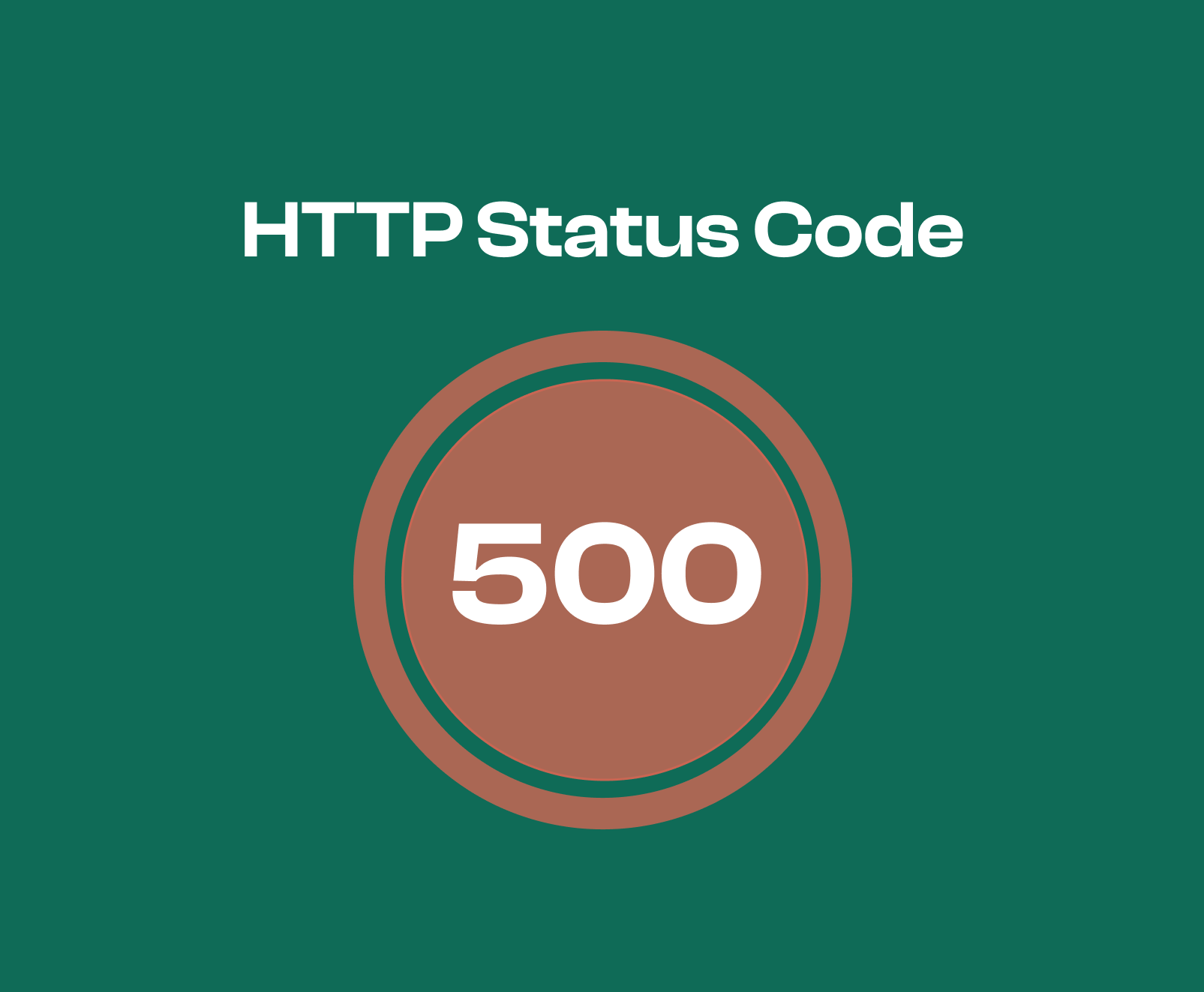
HTTP Status Code: 500 Internal Server Error
SEO
Technical
HTTP Status Code: 503 Service Unavailable
SEO
Technical
Articles Focused On Patents
Leverage SEO Patents To Truly Master SEO
SEO
Technical
Patents
Articles Breaking Down Google SEO Patents
Google's SEO Patents
SEO
Technical
Patents
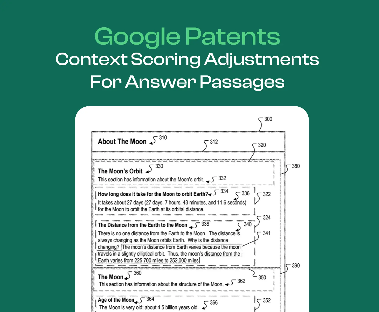
Context Scoring Adjustments Patent
SEO
Technical
Patents
Extracting Facts From Documents
SEO
Technical
Patents
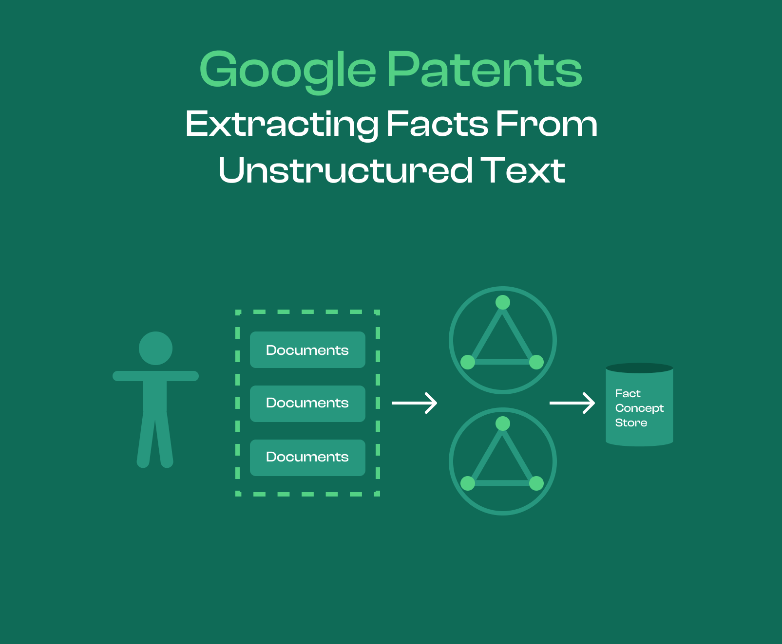
Extracting Facts From Unstructured Text
SEO
Technical
Patents
Articles About On-Page SEO
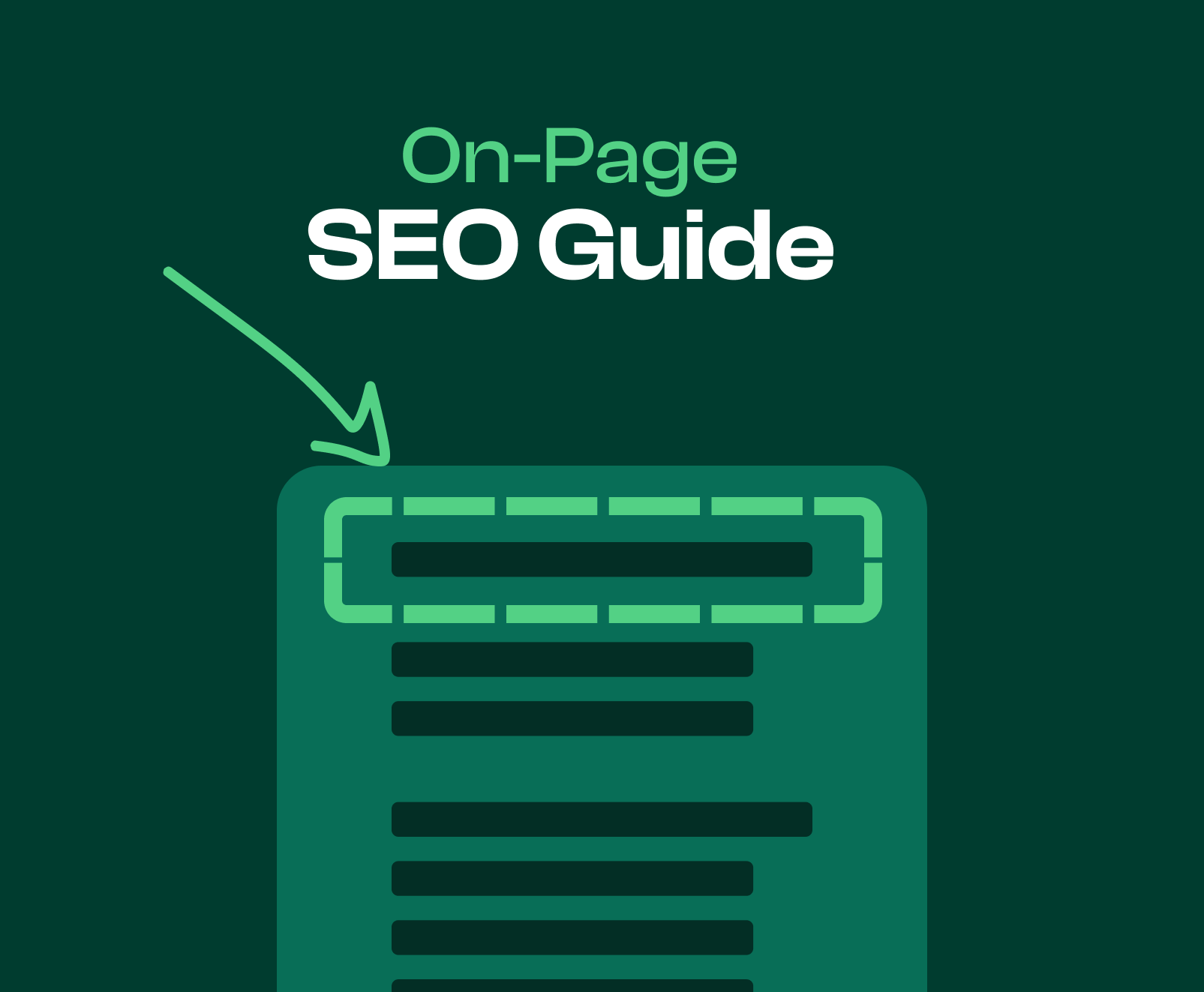
On-Page SEO Guide
SEO
On-Page
Featured Snippets
SEO
On-Page
Bounce Rate
SEO
On-Page
Breadcrumbs & SEO
SEO
On-Page
Articles About On-Page Content Optimizations
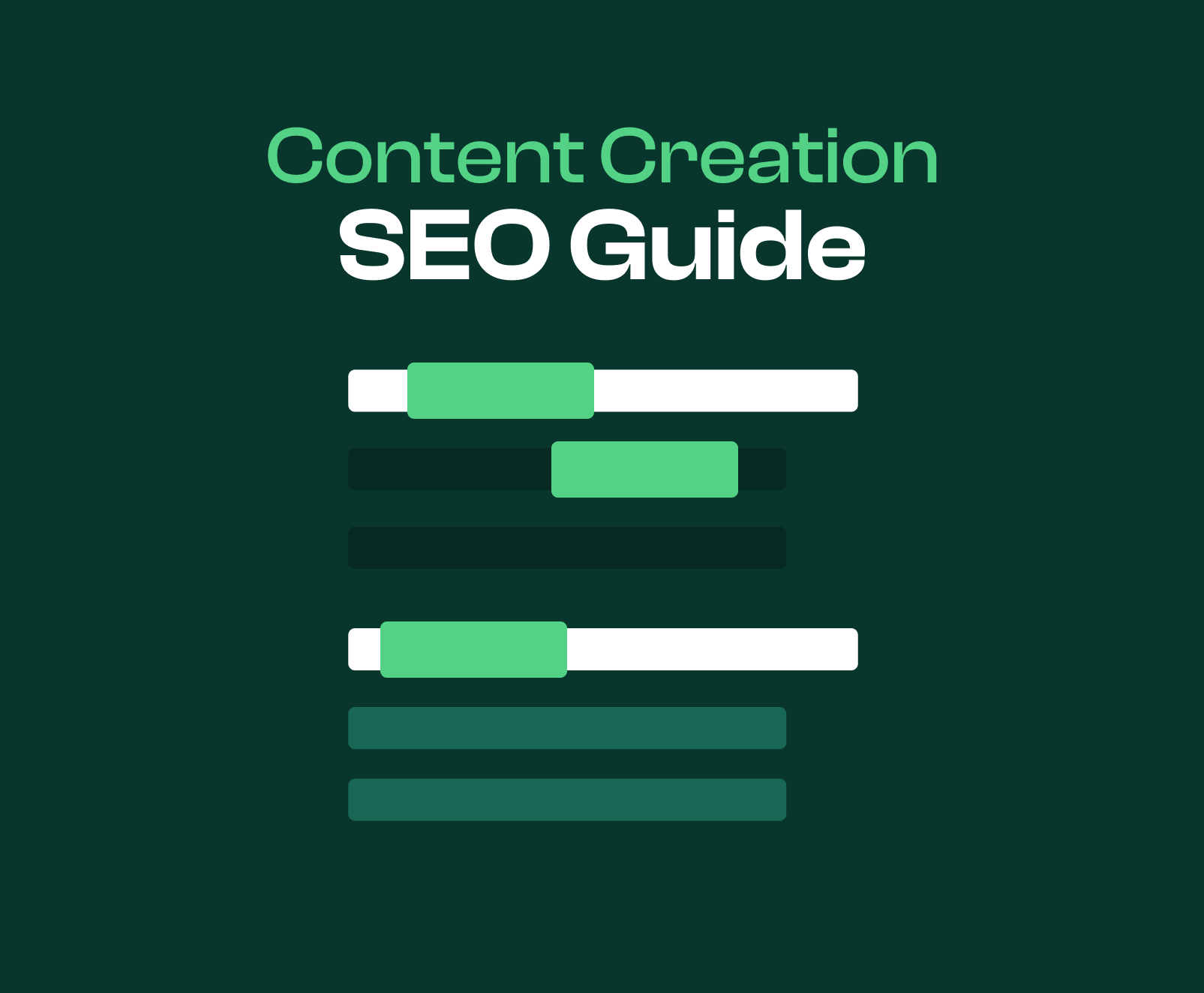
Content & On-Page SEO
SEO
On-Page
Content
Learning About Pillar Pages
SEO
On-Page
Content
Learning About Topic Clusters
SEO
On-Page
Content
Understanding Content Planning For SEO
SEO
On-Page
Content
Content Monitoring
SEO
On-Page
Content
Duplicate Content
SEO
On-Page
Content
Learning About Supplementary Content
SEO
On-Page
Content
Learning About Main Content In The Context of SEO
SEO
On-Page
Content
Thin Content: SEO Mistake
SEO
On-Page
Content
Boilerplate Content & SEO
SEO
On-Page
Content
Importance of Fresh Content
SEO
On-Page
Content
Utilizing Listicles In On-Page SEO
SEO
On-Page
Content
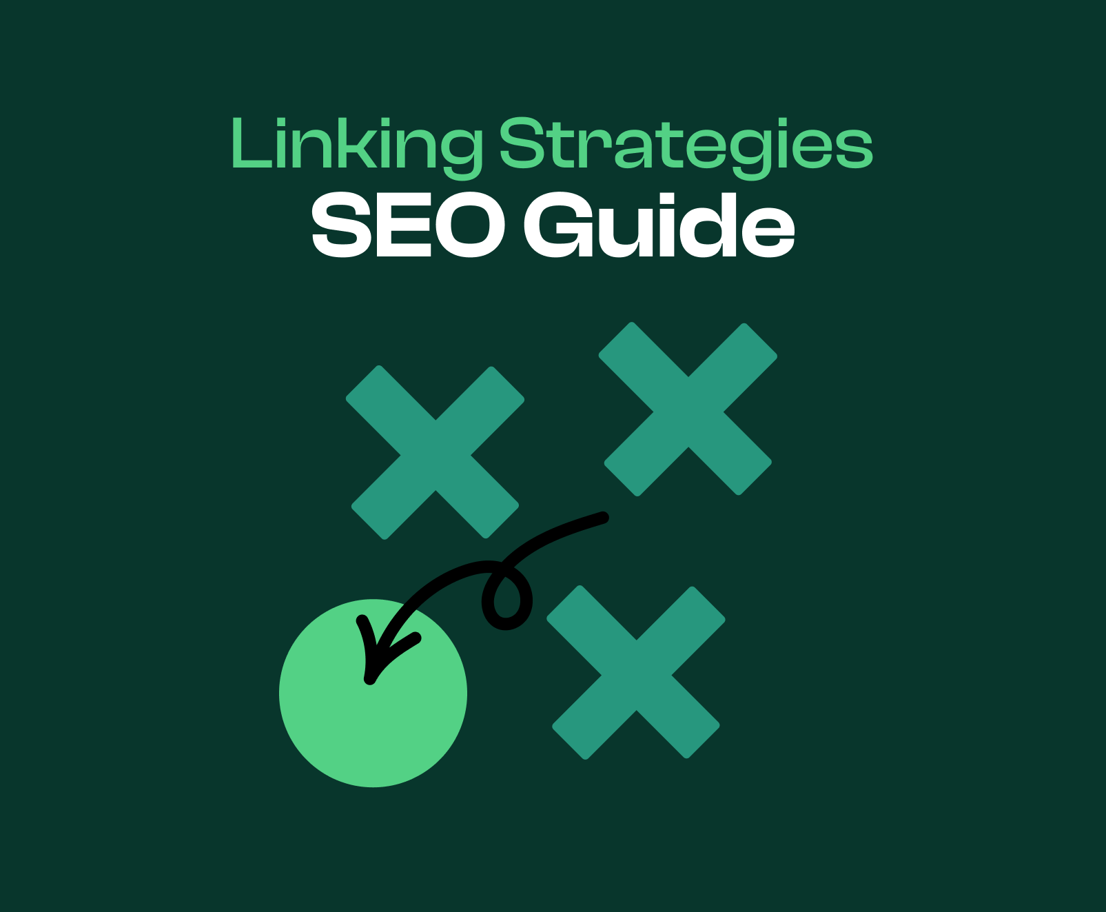
Articles About On-Page Linking Strategies
Linking Strategies
SEO
Keywords
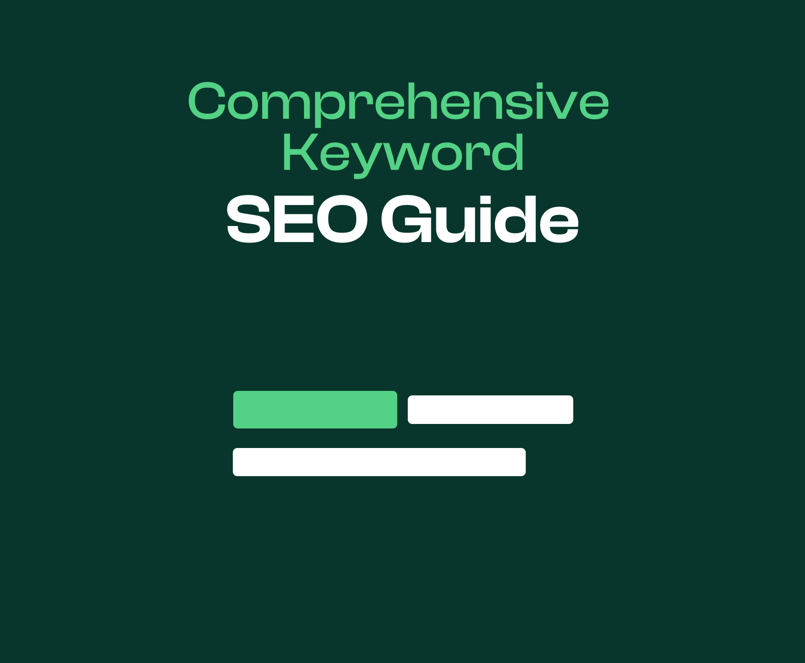
Articles About Keywords
Comprehensive SEO Guide To Keywords
SEO
Keywords
Learning About Keyword Research
SEO
Keywords
Long-Tail Keywords
SEO
Keywords
Short-Tail Keywords
SEO
Keywords
Understanding Search Intent
SEO
Keywords
Understanding Keyword Stuffing
SEO
Keywords
Understanding Keyword Placement
SEO
Keywords
Keyword Questions
SEO
Keywords
Articles On Web Design
Complete Web Design Principles Guide
Web Design
Articles On Conversion Rate Optimization
Conversion Rate Optimization Guide
Web Design
CRO
Understanding Calls To Action
Web Design
CRO
CTA Placement Best Practices
Web Design
CRO
Understanding A/B Testing
Web Design
CRO
Understanding Multivariate Testing
Web Design
CRO
Understanding CRO Analytics
Web Design
CRO
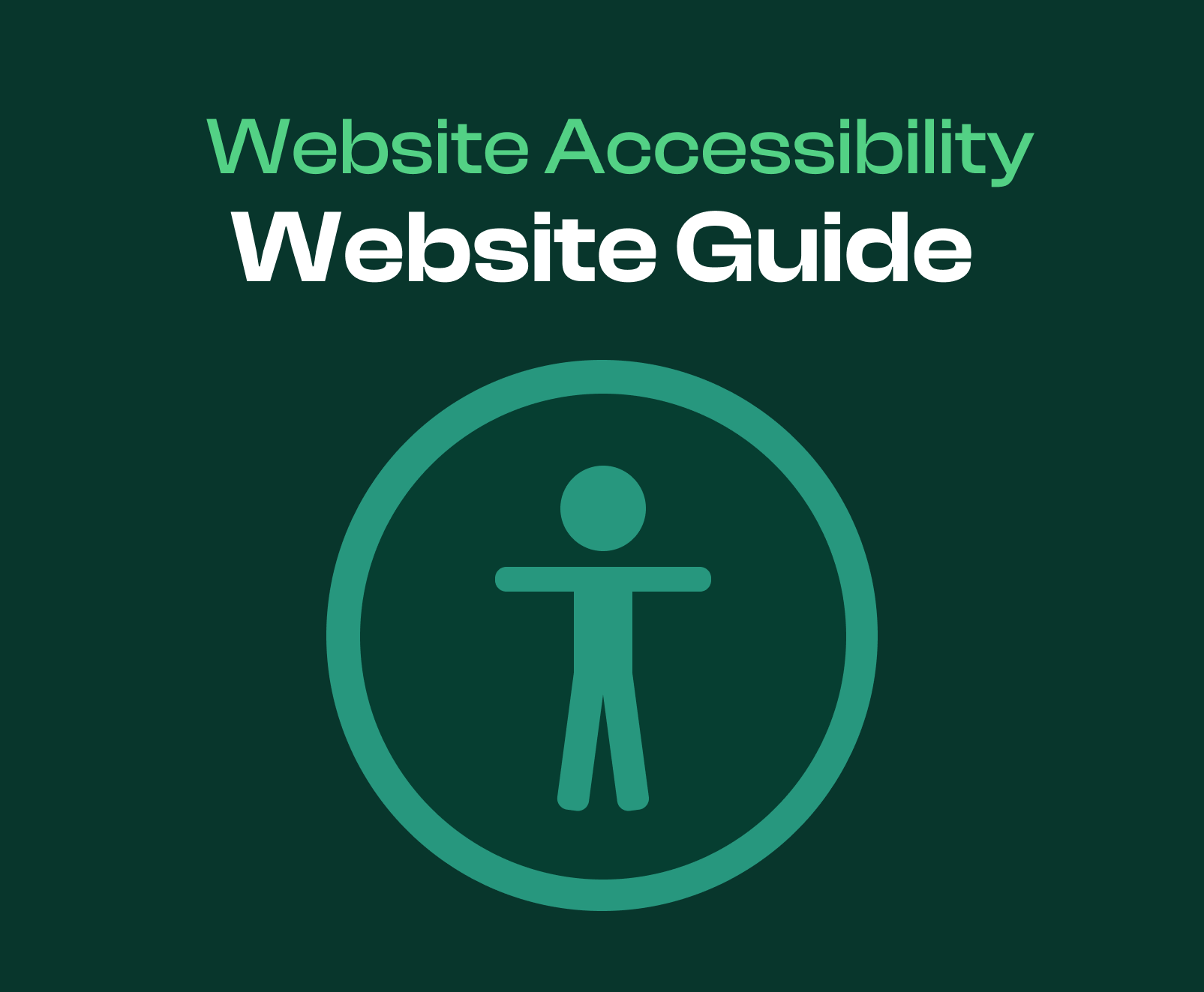
Articles On Website Accessibility
Website Accessibility Guide
Web Design
Accessibility
Color & Accessibility
Web Design
Accessibility
Text & Accessibility
Web Design
Accessibility
Blog Archive
True Or False? Pillar Pages Make Landing Pages Obsolete
SEO
What Is The Primary Goal Of A Search Engine | Spirra Digital
SEO
The 11 Deadly Sins Of Search Engine Optimization
SEO
Organic Search Consulting | Spirra Digital
SEO
Is SEO a One-Time Thing
SEO
What Do You Need To Balance When Doing SEO?
SEO

.png)