Accessible Text Guide
Accessible text is written and presented in a way that allows people with visual, cognitive, motor, and situational impairments to read and understand content without barriers. Accessible text supports assistive technologies, adapts to user settings, and remains legible across devices, zoom levels, and display conditions. Text accessibility is an aspect of modern web design accessibility that is a requirement for inclusive digital experiences and is a bare minimum for meeting most accessibility standards.
Why Is Text Important In Terms of Accessibility
Text is the primary medium through which information is communicated on the web, so ensuring the highest percentage of your users are able to understand your text is important. Screen readers interpret text to generate speech output, braille displays rely on text structure to render content, and search engines depend on text to understand meaning. When text is inaccessible, users cannot perceive, navigate, or comprehend content even if other elements function correctly.
Text As An Accessibility Fallback
Text also acts as the fallback layer for accessibility. Images, icons, and interactive elements ultimately depend on text equivalents to convey purpose and meaning. If users are unable to view images or videos, various elements can help users understand the full context of your content by supplementing their understanding. As a result, if the text is poorly structured or difficult to read - or worse, is absent in the case of alt tags, figcaptions, and other informational elements - these users will not gain any benefit from your media assets at all.
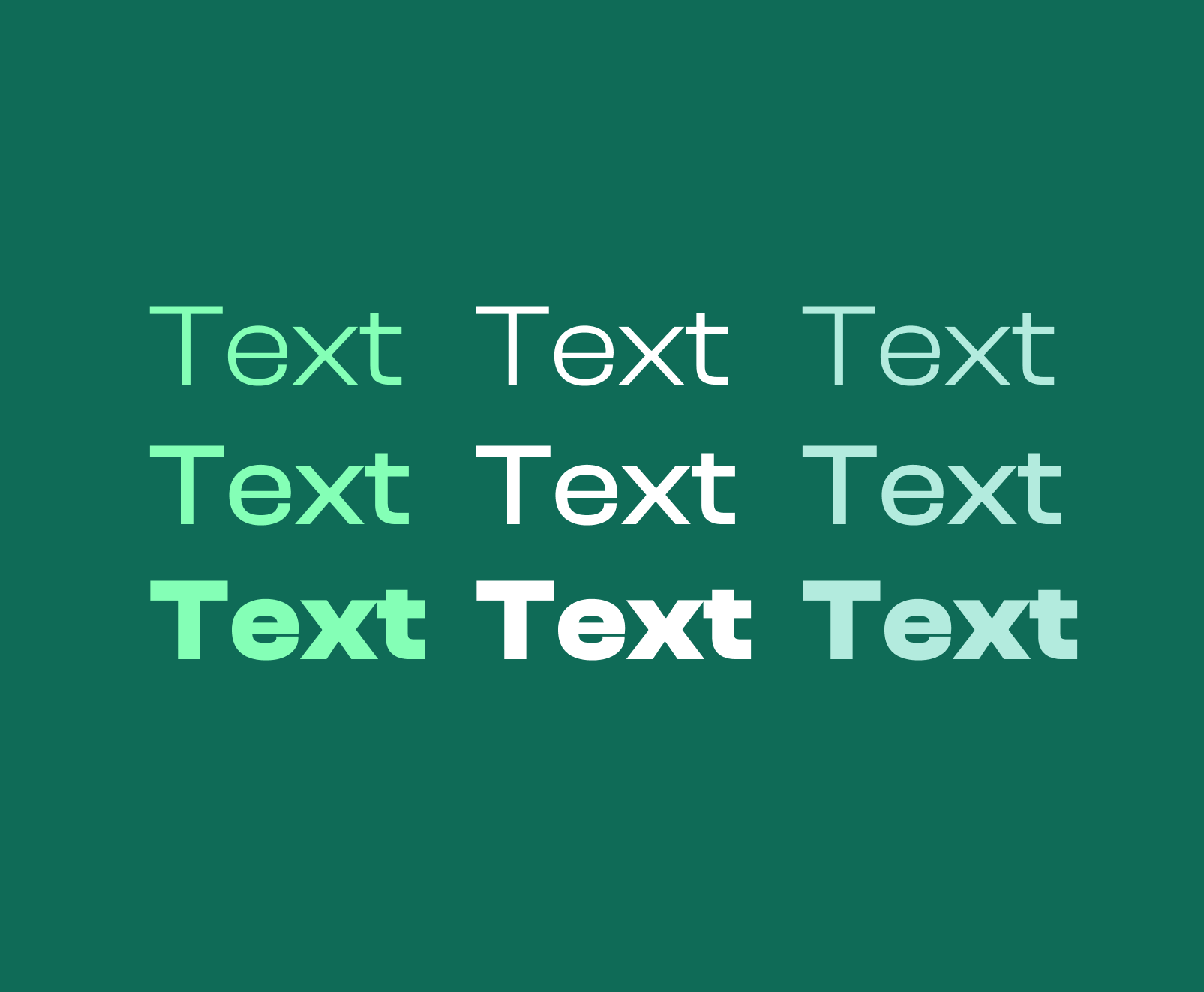
Aspects of Text That Impact Accessibility
Text accessibility is determined by a combination of spacing, sizing, contrast, weight, typeface, and structure. Each aspect influences how easily users can perceive and process text-based information. Problems often emerge not from a single issue, but from multiple small decisions that then hurt accessibility.
Letter Spacing
Letter spacing defines the distance between each letter. Adequate spacing prevents characters from blending together. Ensuring proper spacing also reduces visual fatigue. When you do not use an adequate spacing between letters, legibility suffers, especially for users who have vision disabilities or dyslexia.
Line Height
Line height controls the vertical distance between lines of text. If not enough spacing is used here, it can cause lines to overlap on top of one another, making it difficult to track from one line to the next. Excessive line height can also disrupt reading flow by separating related lines too far apart. By using a standardized amount of spacing, you ensure a uniform and effortless experience for users that helps avoid strain and friction.
Font Weight
Font weight affects the thickness of the strokes in the font. Very light font weights reduce contrast, and make font harder to see for users with visual disabilities. Lighter font weights also make it harder for characters to stand out against the background. Extremely heavy weights can cause characters to blur together, and it can even cause characters to blur with themselves, depending on the font family.
The best font weights are those that provide an adequate amount of color contrast, while also being easy to read. In most situations, you should have 3-4 font weights that are standardized across your website and are all compliant with modern accessibility standards.
Color Contrast
Color contrast defines the difference in the color of the font and its background. Low contrast makes text difficult or impossible to read for users with low vision or color vision deficiencies. Contrast issues are one of the most common accessibility failures. By ensuring there is adequate contrast for your text in all situations, you ensure more users are able to perceive, utilize, and understand your content.
Font Choice
Font choice influences character legibility and user reading speed. Decorative or overly stylized fonts reduce visual clarity and increase strain and fatigue. Fonts with ambiguous characters make it harder for users to distinguish similar characters.
Accessible font choices prioritize clarity, consistency, and predictable shapes. Fonts should support a full character set and render reliably across platforms and operating systems.
Text Grouping
Text grouping helps users to recognize hierarchy and the relation between topics. Poor grouping forces users to infer relationships between sentences, sections, and topics. Large and unbroken sections make it difficult and tiring for users to read through. By ensuring you naturally section text by paragraphs helps ensure users are able to scan through your content easily.
How To Resolve Text Accessibility Issues
Resolving text accessibility issues involves testing text under zoom, increased spacing, high-contrast modes, and with assistive technologies. When text remains readable and structured under these conditions, accessibility issues are typically resolved.
Keeping Up With Advancements In Accessibility Technologies
There are continual advancements in accessibility tooling, so ensure you are always staying updated with the latest technologies and resources. By doing this you will ensure you know which aspects of accessibility you still need to iterate and improve upon.
Lean On Our Expertise
Accessible text requires intentional design, technical precision, and advanced QA and testing. One of our web design services includes accessibility handling. Whether you have an existing website or are building new, we can administer audits, tests, and optimizations. We identify issues that automated tools miss and implement solutions that scale across your content ecosystem.
However, if you are planning a new website and if your site content must serve diverse users without sacrificing clarity or performance, our expert guidance ensures accessibility is built into the foundation rather than patched after problems surface.